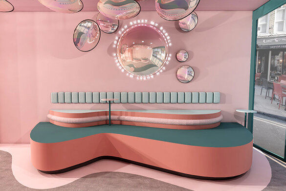
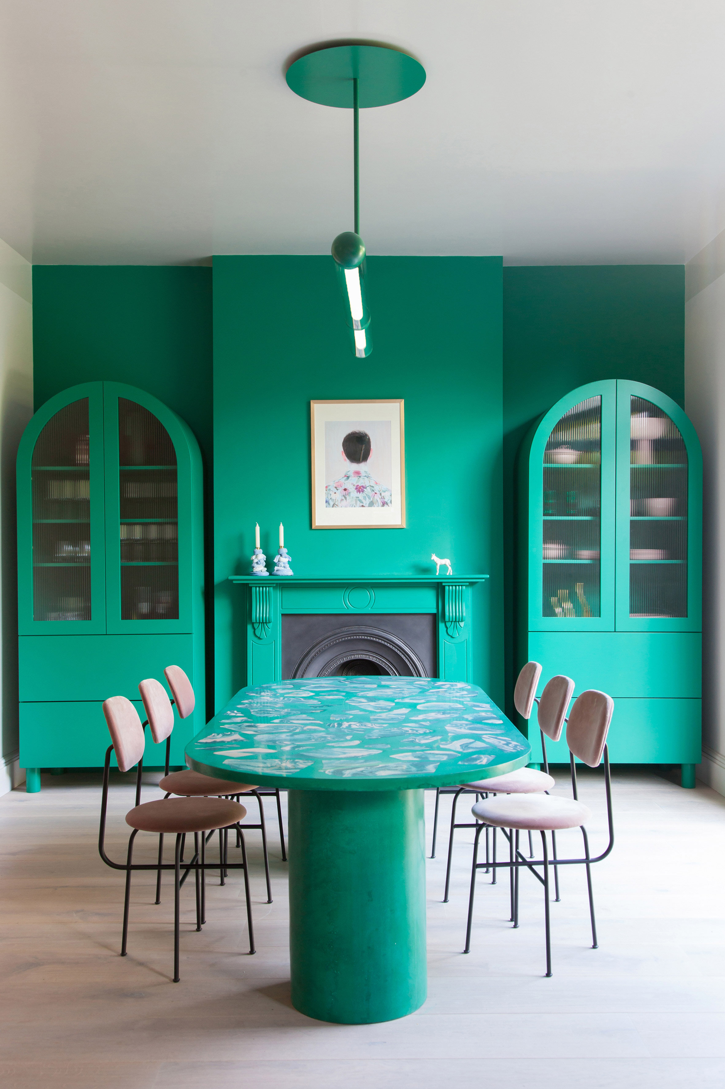
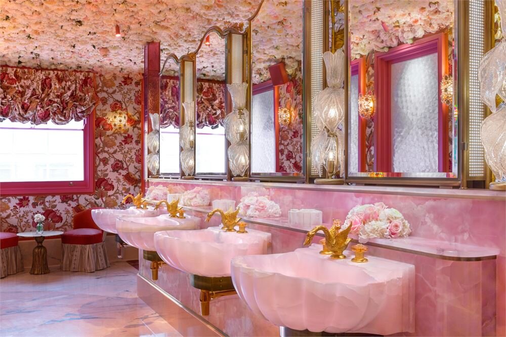
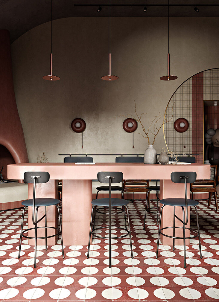
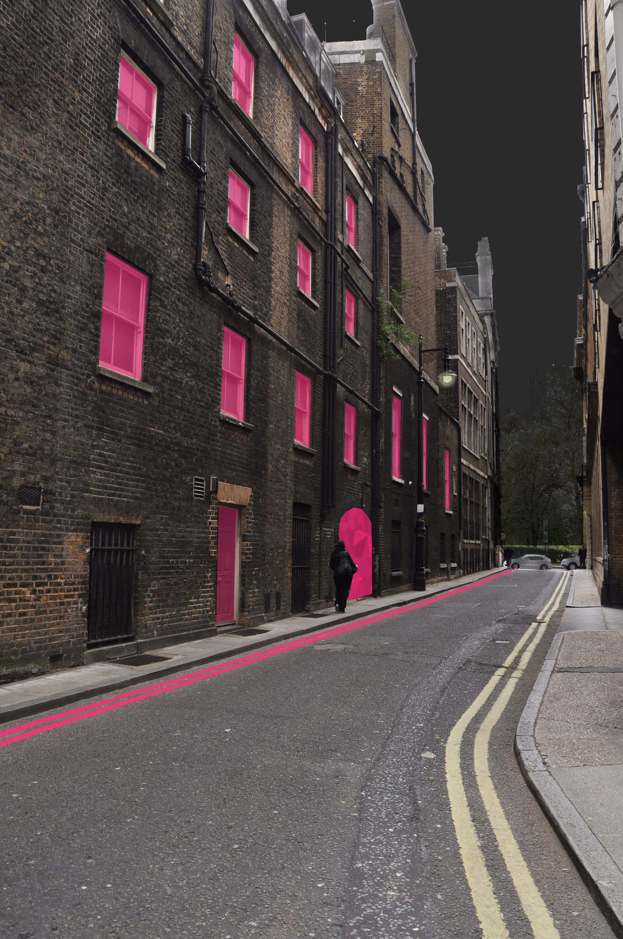
PRETTY AS A PICTURE (aka the instagrammable interior)

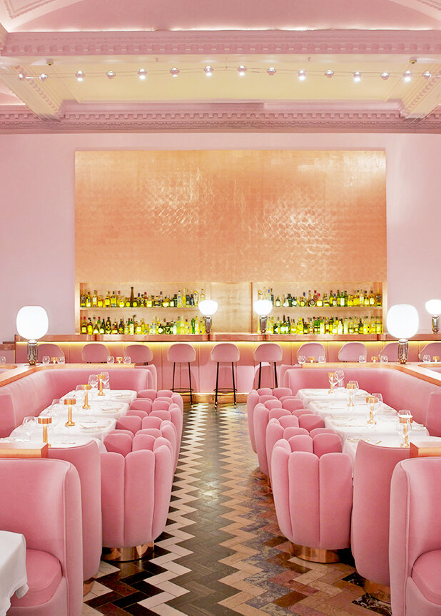
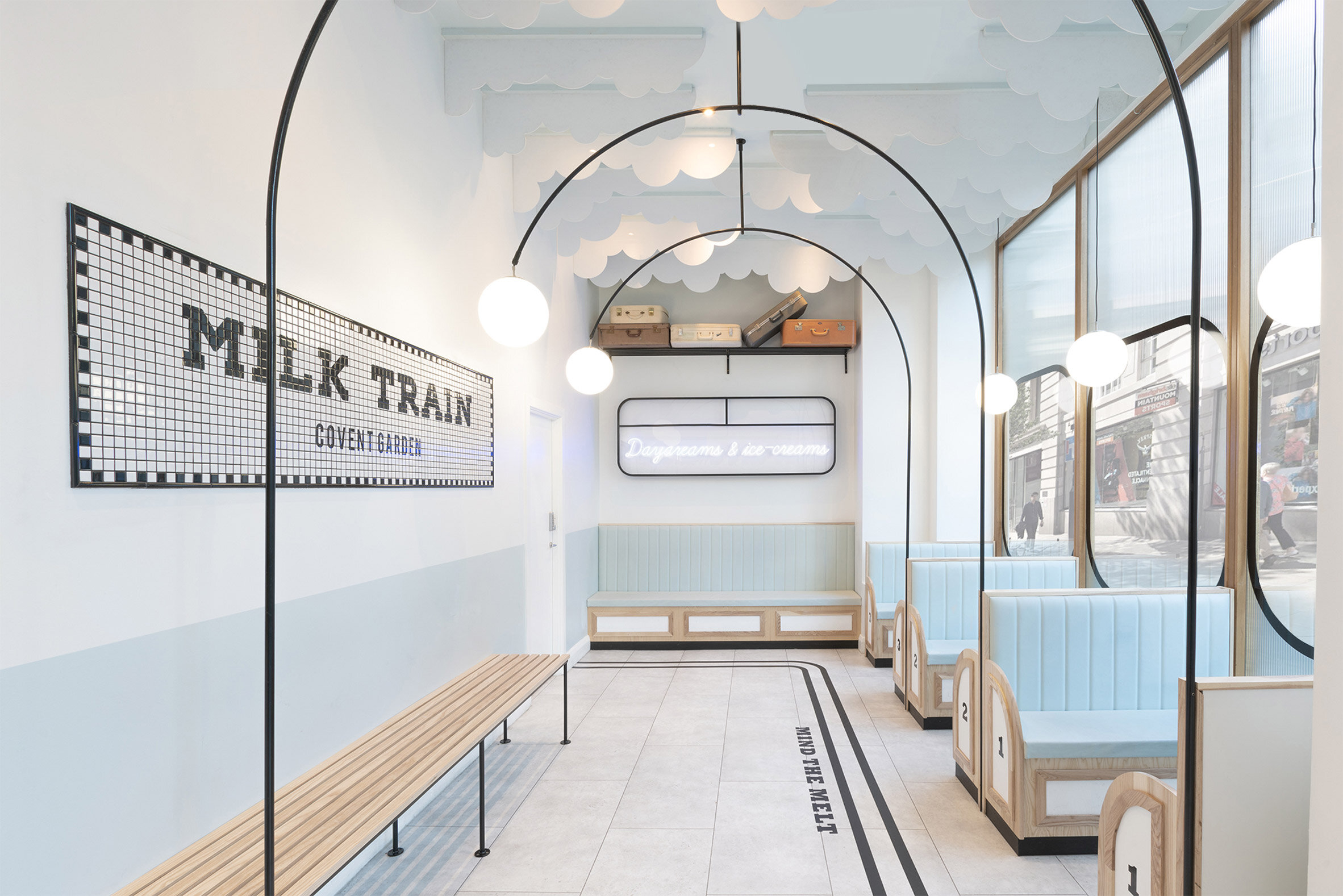
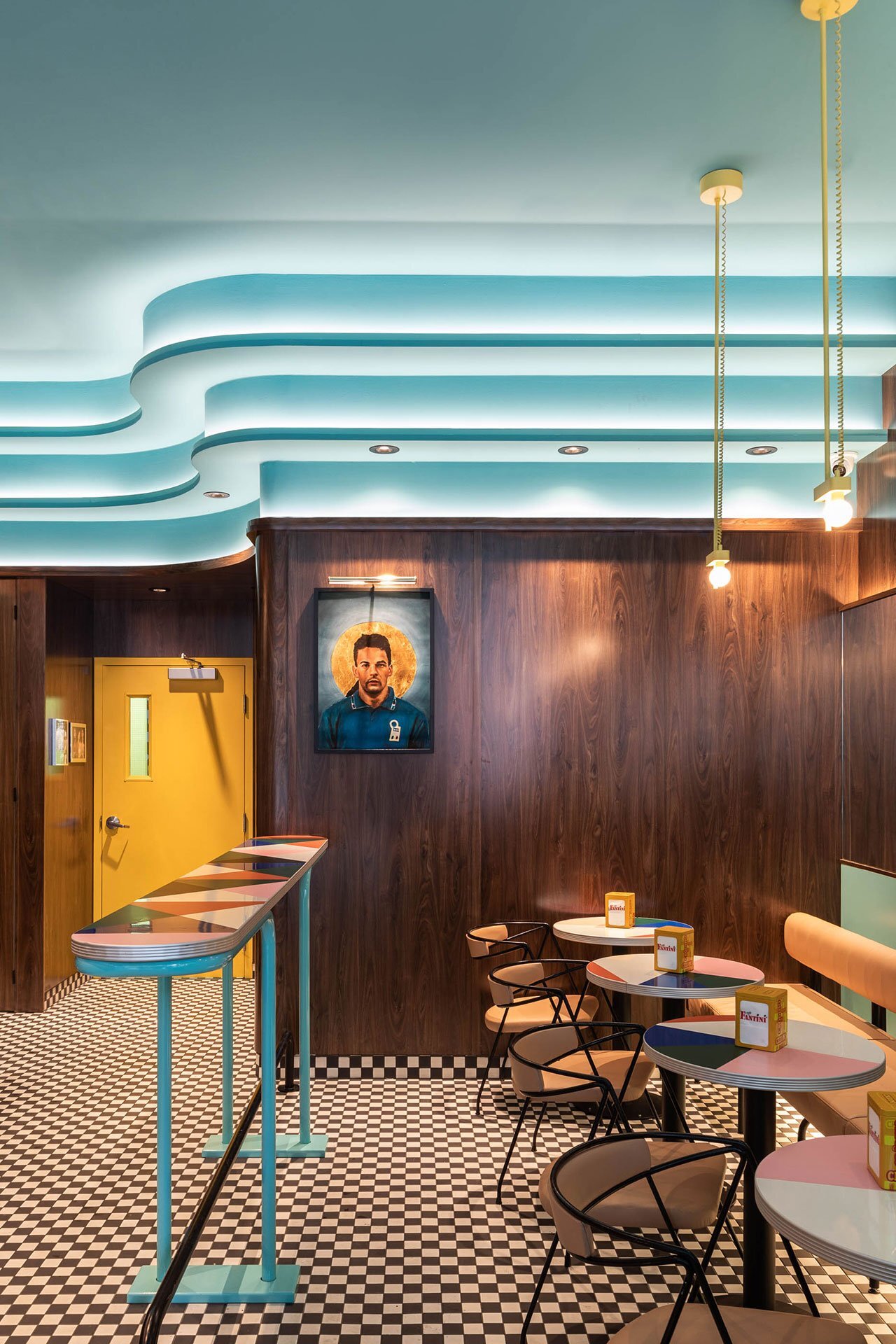
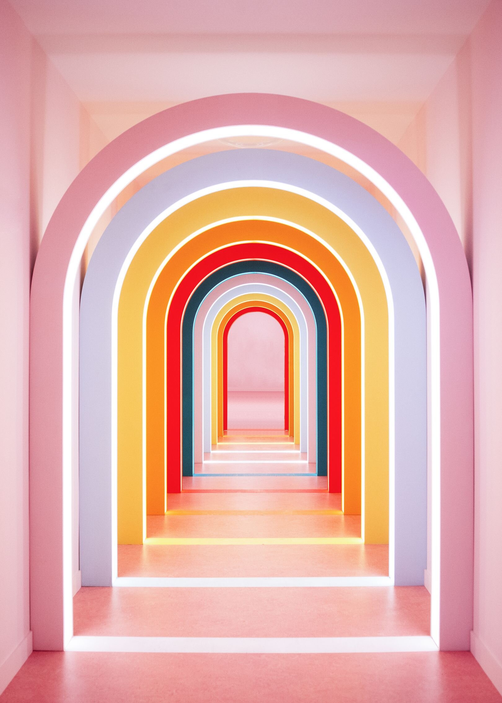
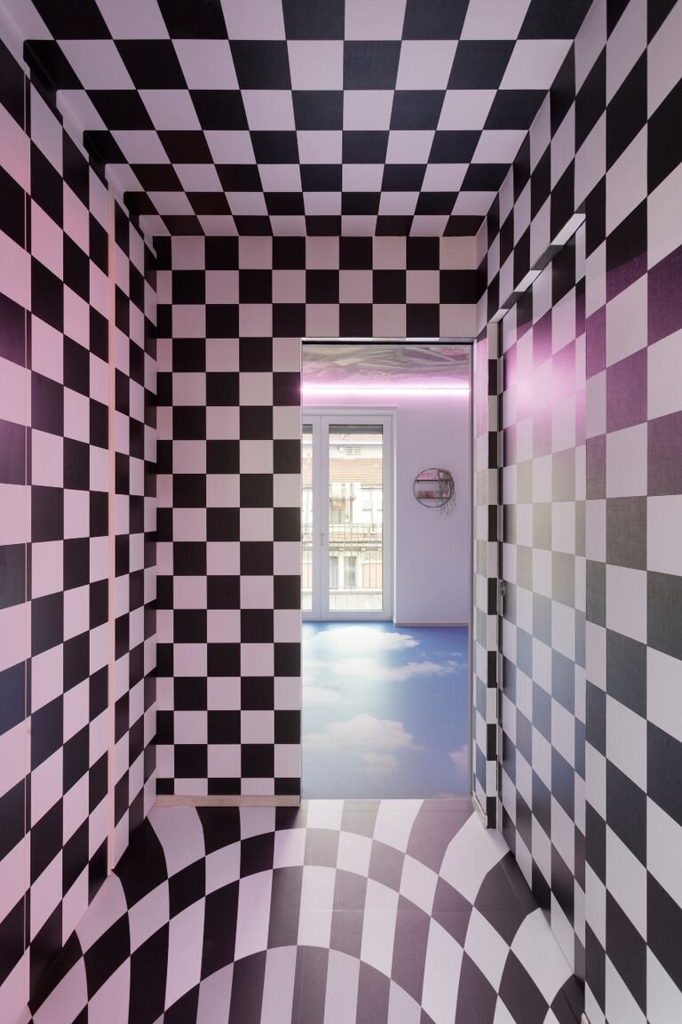
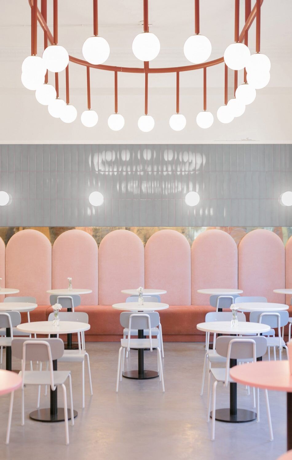
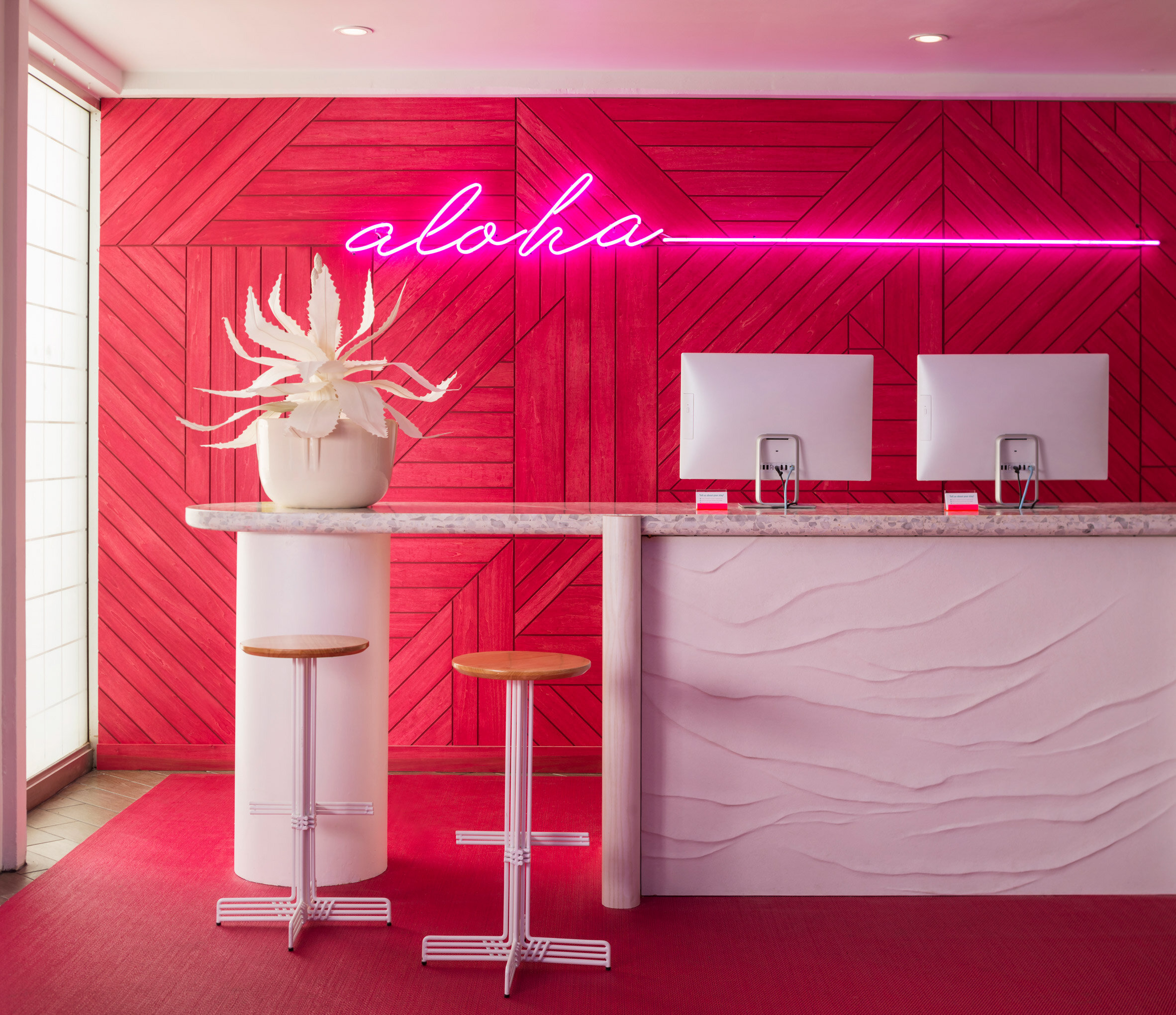
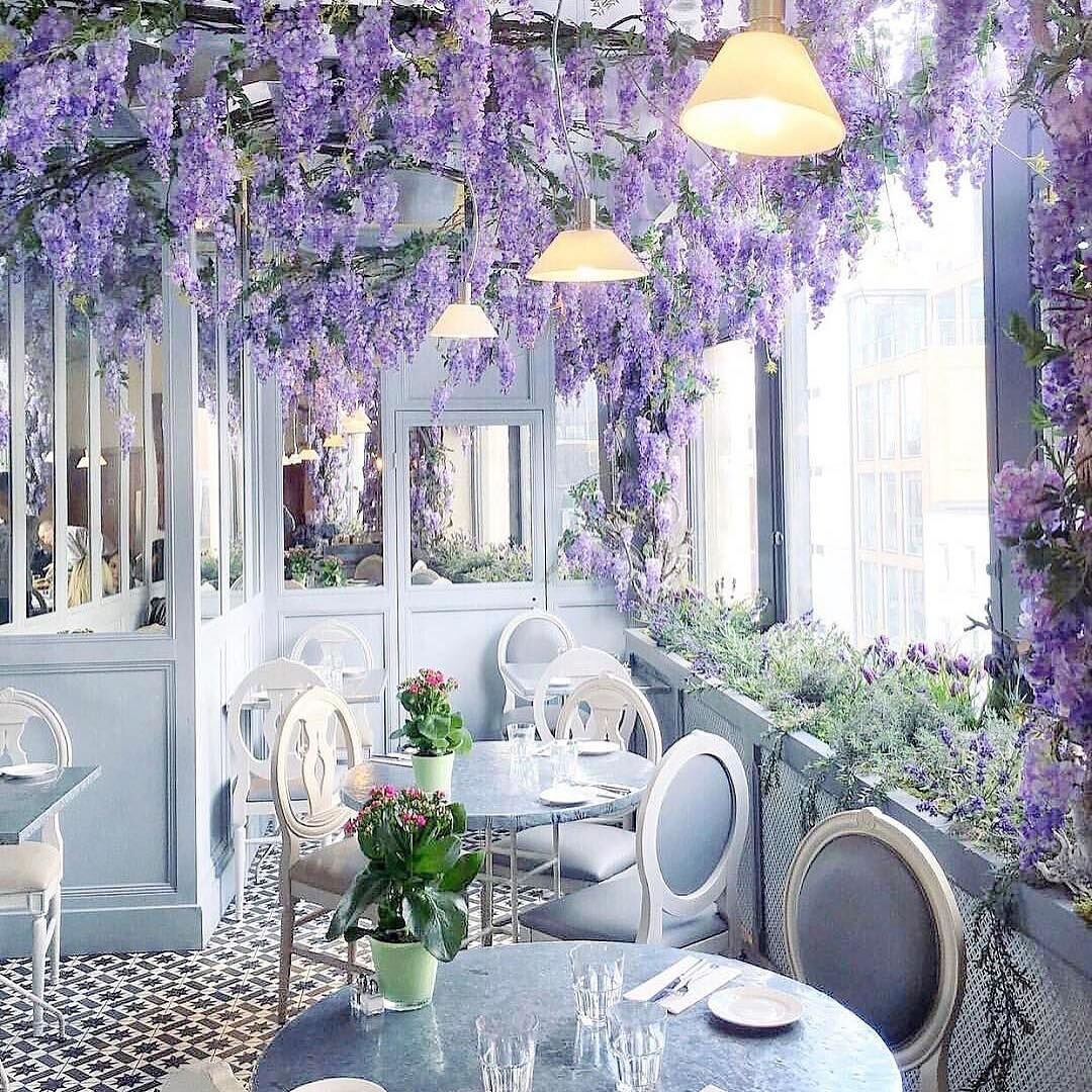
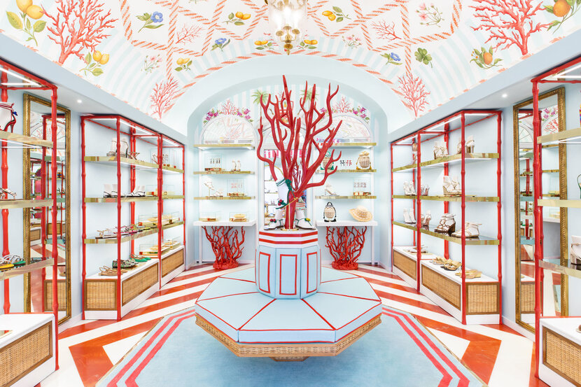
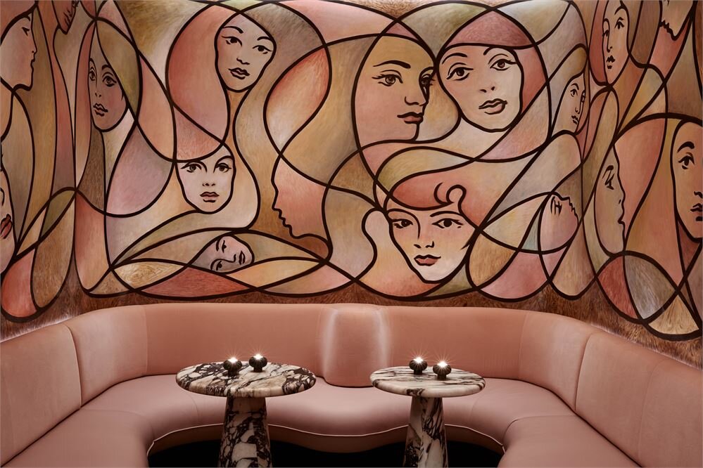
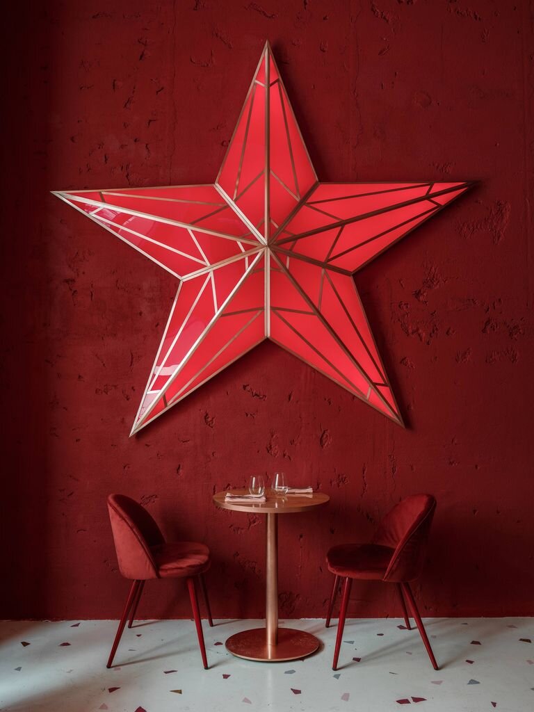
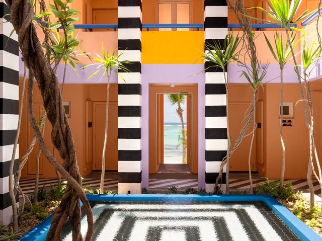
Theatricality in commercial interiors certainly was a thing long before Instagram - think the iconic Sketch designed by India Madhavi back in 2003. In the era of the selfie, however, creating “Instagram moments” has become an essential part of the brief given to designers in hospitality, retail and even some residential projects.

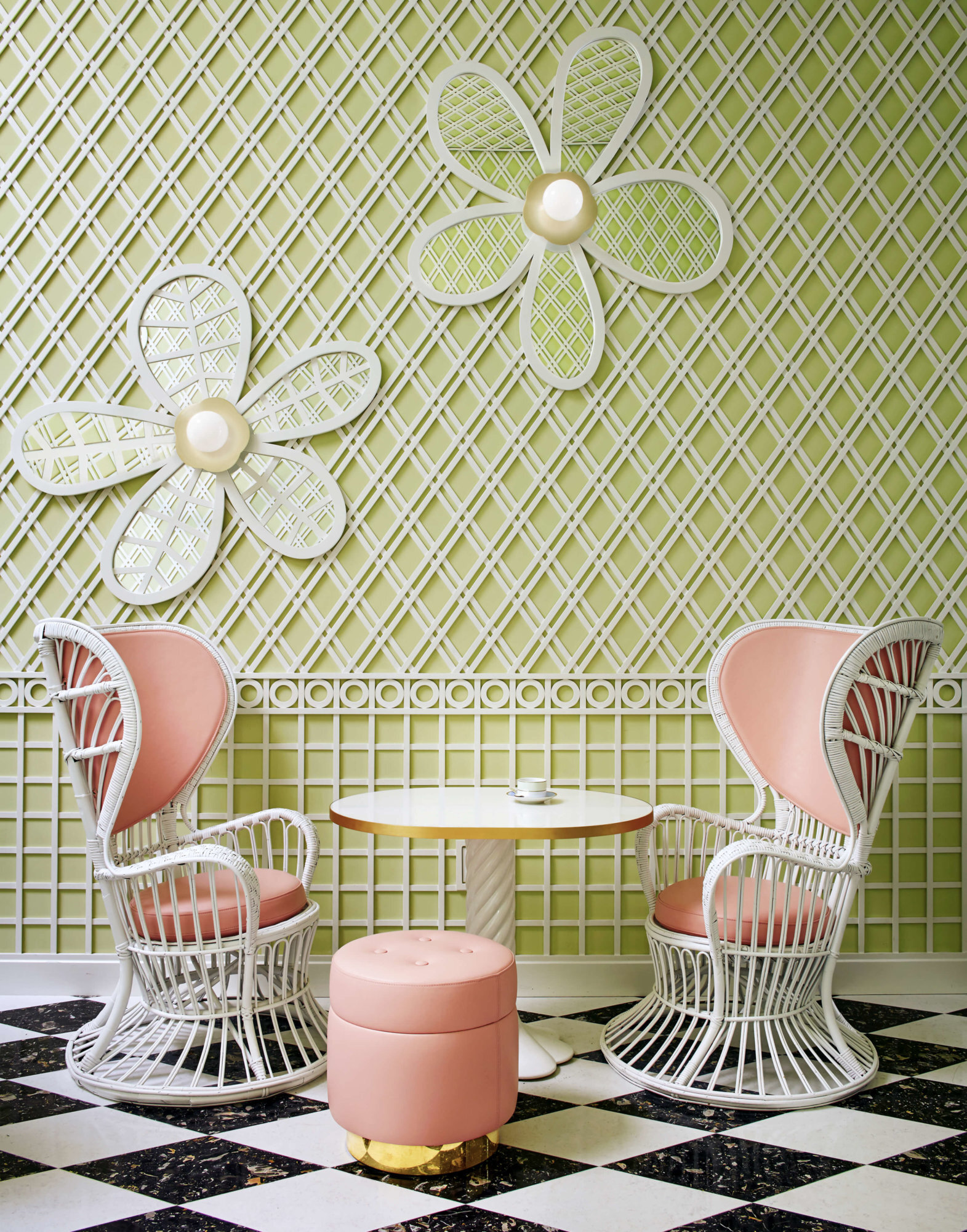
What makes an interior “instagrammable” , might you wonder? Photogenic appeal seems to be powered by a strong graphic essence, a fearless use of colour, surprising and whimsical elements, playfulness and fun. Interestingly, pink is often the hue of choice - but then, it’s a most flattering colour for all skin tones.

For designers, planning interiors for the gram is definitely a challenge: get it wrong and you’ll create something gimmicky and lacking authenticity, get it right and you’ll hand to your clients a very powerful branding tool, as well as having people flocking to take pics of your loos. Now, that has to be a legacy worth working for.

Image source: Sketch - La Durée - Milk Train - Defhouse - Ice Cream Museum - 2LG Studio - Dyce - Buha’i’rest bar - Annabel - Shoreline Hotel - The Berkeley Bar - Caffetteria - Aubaine - Tiffany

FINDING YOUR TRUE COLOURS

DSC_0113.jpg

For as long as I remember, I felt a certain clarity when it came to colour: I knew what I liked and had the confidence to trust my own instincts. The reason is simple enough: I just really like colour.

Working with clients, however, I’ve realised that, for many, choosing colour for their homes can be a daunting task. There’s a real anxiety of getting it wrong, which can translate into playing it safe - or worse, in the inability of making any decision. Fear not, there’s help at hand.

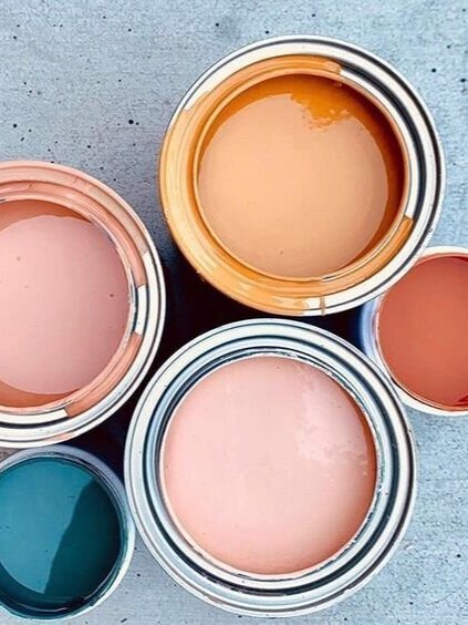
GO FOR PAINT Paint is readily available, easy to apply even for the unskilled and, most importantly, relatively inexpensive. Premium brands offer better quality pigments, therefore more colour depth, but any kind of paint has a hugely transformative power.

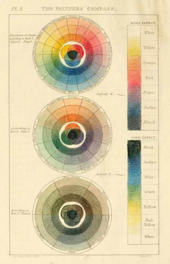
THE SCIENCE BIT Familiarising yourself with the colour wheel theory can be a useful way to start. In summary, a monochromatic scheme would use one colour only, in different shades (it’d feel uncluttered and harmonious). A complementary scheme would use colours that sit opposite on the wheel (by playing on contrast, it’d enhance the intensity of opposing colours and add drama). And finally, a related scheme would use adjacent colours on the wheel, with one being the dominant colour and two on either side used as companions (good way of successfully implementing existing colours).

THE RULE BOOK I don’t believe there are rules to be observed as such but there are a few things worth considering. Warm colours can make a room feel cosy by making spaces feel smaller. On the other hand, cool colours can make a room airy by making the spaces feel larger than they are. North facing rooms (in the northern hemisphere, that is) can be tricky as the light coming into the room can feel cool - colours with warmer undertones are therefore preferable to counter balance this. Forget about having to paint a darker room in a light colour to make it more interesting - you’ll be achieving exactly the opposite of that.

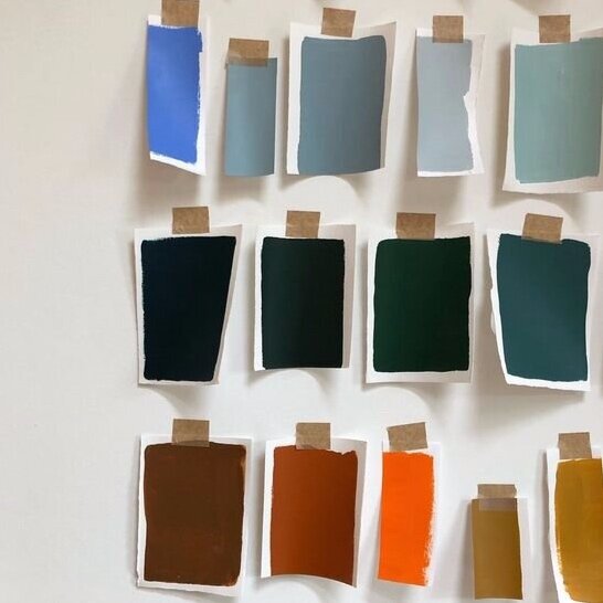
SAMPLE, SAMPLE, SAMPLE! Never choose a paint colour from a tiny chip on a colour card - it’s a recipe for disaster! Select the colours you’re attracted to and buy sample pots for them. Instead of applying paint directly on walls, create large sample cards with cartridge paper (A4 at least). Move the samples around the room you wish to paint and look at them in different light conditions (natural, artificial, morning, afternoon, evening). Different light conditions can affect the perception of colour immensely, so always take your time before jumping ship.

If you still haven’t found the colours you’re looking for, or would like an extra hand getting started, do get in touch for a colour consultation.